

Last week the Forrester Wave for B2C customer data platforms came out, and I spent more time on the legend than on the chart. That's not where I expected to end up.
Ten companies on the graphic.
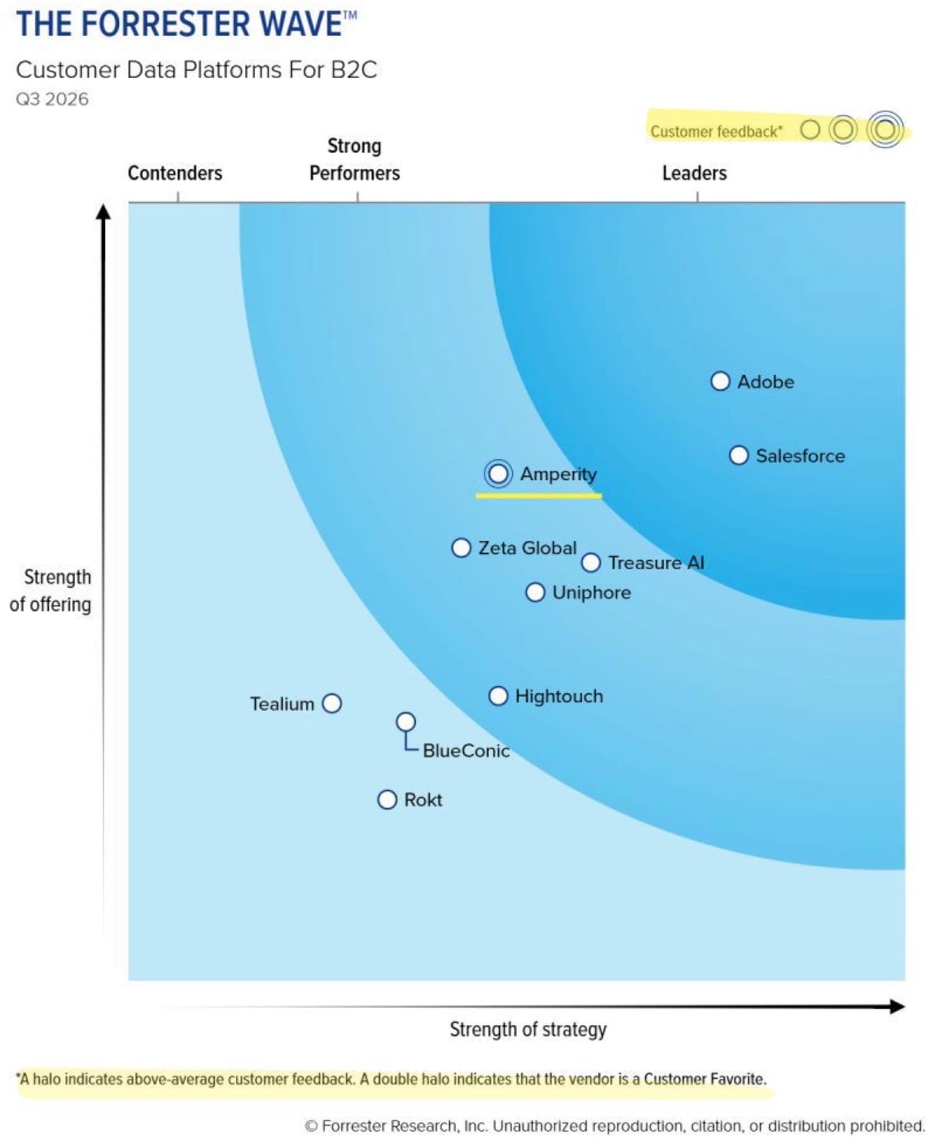
One of them, Amperity, carries a halo around its marker. Forrester's own footnote spells it out:
A halo means above-average customer feedback, and a double halo means the vendor is a Customer Favorite.
Nobody else on the chart carries a halo at all. And nobody at all carries the double, so the Customer Favorite designation went unawarded in this market.
I said as much in a short post.
Then I went looking for how that mark actually gets made, and the method turned out to be more interesting than the placements.
What left the chart in 2024
The Wave you're looking at isn't the Wave from two years ago, and the difference is not cosmetic.
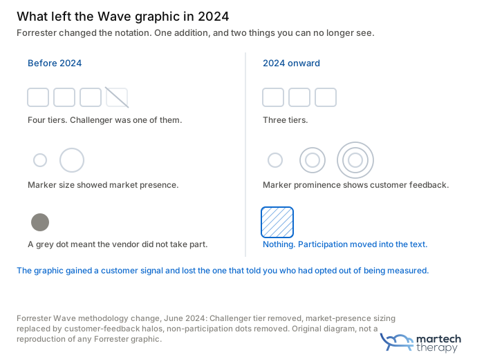
In 2024 Forrester dropped the Challenger tier. Three bands now, not four. It also stopped using marker size to show market presence and started using marker prominence to show customer feedback instead.
That's the halo.
Where the graphic used to tell you how big a company was, it now tells you how its customers scored it.
I like that trade. Size wasn't the interesting question anyway, and plenty of people were misreading a big dot as a recommendation.
But something else came off the graphic at the same time.
Forrester used to mark non-participating vendors with a grey dot, and that marker's gone. Participation shows up in the written profile now, which means the picture no longer tells you whether the company you're looking at took part in its own evaluation.
That matters more than it sounds.
A company that skips the process still gets scored, on public information, which caps what anyone outside can establish about it. Forrester says so plainly:
When vendors decide not to take part in the formal evaluation, it assesses them under its vendor participation policy instead.
Two years ago you could see which markers were built that way. Now you have to open the vendor profile to find out, and most people who look at a Wave never get past the graphic. It's true.
One addition, one removal. Only one of them made the coverage.
What the halo is actually scoring
This is where I slowed down. I was involved in a lot of user research in the past. I am still passionate about it today.
Forrester's methodology page sets out how customer feedback gets assessed. It considers whether the vendor provided the full complement of reference customers that Forrester requested, the response rate from those references, and the breadth of relevant functionality or services those references cover.
Since 2024 they're interviewed live rather than surveyed.
So those criteria measure two different things and print one mark.
The first is what customers think. That's the one everybody assumes the mark is about.
The second is whether a company can produce the customers Forrester asked for and get them to pick up the phone. Knowing which accounts to nominate. Having the relationship to ask. Having somebody whose job it is to chase a response rate through August.
Both are real capabilities, but only one of them is the product.
A company with satisfied customers and a strong reference program will out-mark a company with satisfied customers and no reference program. The graphic prints one symbol for both.
Amperity taking the only halo here is a real result, and I wouldn't take it away from them. What I won't do is treat it as "customers rate Amperity highest of these ten", because the notation doesn't carry that claim and Forrester's own criteria are the reason it can't.
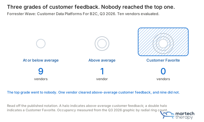
The nine bare markers are where this gets uncomfortable.
A bare marker can mean feedback that came in below the group average. It can also mean fewer references supplied than requested, or references who never called back.
From outside, how would you tell? If you're building a shortlist off this chart, that distinction changes what you do next.
A halo tells you a reference program worked. It doesn't tell you that the deployment you're about to attempt resembles the ones Forrester heard about, and the criteria themselves include the breadth of functionality those references cover, which is Forrester making the same point more politely than I just did.
Picture that request from the other end.
A vendor needs references, so an account manager emails the people who bought the platform and asks whether they will give an hour to a Forrester analyst. Saying yes is a favor, and favors turn on ordinary things. Whether the platform embarrassed anyone last quarter. Whether the person who ran the implementation is still in the job, because when that person goes, the one contact who could tell the story well goes with them and the reference never happens.
None of that is about the software and the selection is often biased.
The comparison Forrester won't let anyone make
Almost every summary of a new Wave is a trend line.
Who climbed, who slipped, who fell off.
My experience with these reports started that way too.
Forrester's citation guidelines forbid the companies being evaluated from doing exactly that:
Comparisons or references to past Forrester Waves on the same market, such as "A Leader for the second year in a row", are prohibited unless cited verbatim from the current Forrester Wave evaluation text.
So a company that's been a Leader twice isn't allowed to say so. Meanwhile that's exactly how the rest of us read a new one the moment it hits the feed.
The numbers underneath show why that rule exists. The 2024 evaluation covered twelve companies against twenty-nine criteria and named four Leaders, where this one covers ten against twenty-five and names two.
You can see it in the movements.
Amperity was a Contender in 2024 and it's a Strong Performer now, carrying the only halo on the chart. Treasure Data was a 2024 Leader and shows up in Strong Performers today as Treasure AI. ActionIQ was a 2024 Leader too, and its technology now lives inside Uniphore, which came in as a Strong Performer. Hightouch and Rokt weren't on the 2024 chart at all.
And Forrester's blog describes the emphasis moving past profile building and audience generation, toward decisioning, orchestration, and AI-powered execution. So the report category is asking a different question of the same market. Optimize for the old question, and you can drop a band without changing a thing you do.
Twelve companies didn't get worse in the same eighteen months.
The measuring moved. Significantly.
Honestly, there's a piece of this I can't settle from outside the report. Hightouch turns up on a Forrester CDP Wave for the first time here, and I don't know whether that's because Hightouch changed or because the inclusion criteria did (warehouse-native finally counting would do it).
Forrester's methodology says the analyst writes the inclusion criteria for each evaluation, so both are live. I'll know more once I've been through the thing properly.
The part where I admit my angle
A lot of my work is replacing Salesforce and Adobe. I won’t try to deny it. They can call me if they want to find out why.
Nobody calls me when the platform's going well, so my sample is skewed toward the ones that hurt.
I also went at this once before.
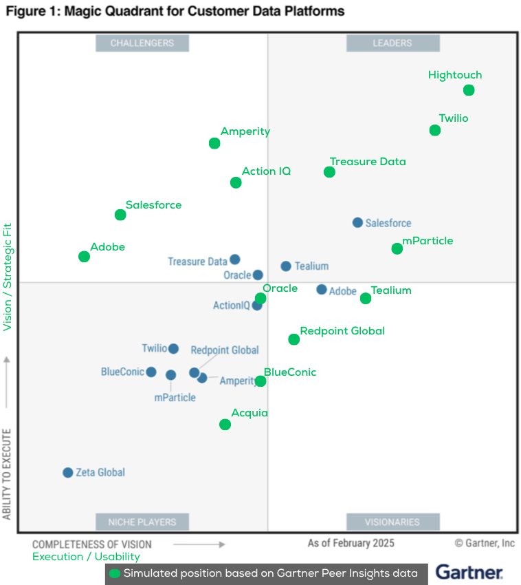
In August last year I rebuilt Gartner's CDP Magic Quadrant on Peer Insights review data, and Hightouch came out a Leader in my version while being left out of the real one entirely. Gartner's own Voice of the Customer said much the same a month later.
So when I say the customer signal and the analyst signal are different instruments, that's not a hunch I formed this week. I've also written about the quadrant going stale between editions, which is a different complaint and still true.
None of that makes this Wave worthless.
It makes it a document with a job, and the job is more niche than the coverage around it suggests.
The job it does well is telling you who the analyst thinks belongs in this market, and what the analyst now thinks the market is about. That second part is the actual news, and it barely got covered, because a redrawn evaluation metric doesn't share as well as a company moving up a band.
What it can't do is tell you whether your team can operate any of these.
Strength of offering and strength of strategy describe the platform. Neither one describes the organization that has to keep it alive. That's where every repair project I've worked on started, and that gap doesn't have an owner.
There's still nothing standing between the analyst firms and the buyer, which I complained about at length in the CDP RFP dating game and have watched not change since.
So what do you do with the next one?
Open the legend before you read the placements. And if you're about to spend seven figures on the strength of a dot, ask the vendor how many references they were asked for, and how many they managed to supply.
Do you have any questions after reading this article?
Or need support with your Martech projects?
Discussion